
The Dance of Colors: Ultramarine Blue and Burnt Sienna
The Secret to Vibrant Color Mixing? Choosing the Right Paint Pairings
Unveil the secrets of color harmony with Ultramarine Blue and Burnt Sienna—the Earth’s natural symphony of hues. Contrary to belief, a restricted palette of earthy tones doesn’t result in dull artistry. Embrace the richness of Yellow Ochre, Terra Cotta, and other earthy tones for captivating artistry.


Share This
Story
Linkedin-in
Facebook-f
Instagram
Twitter
Bullhorn
Ultramarine Blue and Burnt Sienna – A Match Made in Color Heaven
When forced to choose just two paints, look no further than Ultramarine Blue and Burnt Sienna. This dream team produces luscious neutrals perfect for shadows and figures. Their inherent vibrancy also interacts to remind you of breathtaking summer skies.
Together, these two colours sing. They make the most delicious range of neutrals; the Sienna is fleshy enough for figure work, the Ultramarine is perfect for the fleshy greys of shadows, and with full strength, they interact as complementaries that remind you of summer days.
On their own, these two pigments cover a wide range. Together, they mix into fleeting sunsets, rosy flesh tones, and everything in between. Keep this versatile pairing on hand for mixing magic.
Spread the love!
Pass this along to someone who’d appreciate it.
More Vibrant Mixing with the Primaries Plus Two
In theory, combining the primary colours red, yellow, and blue should yield a limitless palette.
However, due to pigment limitations, more is needed for nuanced mixing.
The solution? Choose cool-toned primaries, then add white for tinting and deep green for licenced blacks.
Alizarin crimson, phthalo blue, and lemon yellow produce an astounding spectrum. Finally, phthalo or viridian green completes the palette.

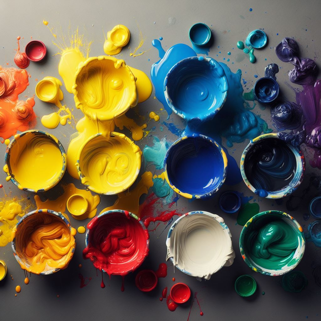
Unlock Your Full Potential with Warm and Cool Versions
Are you ready to truly master colour mixing? Include both a warm and cool version of each primary colour. This exploits the strengths of each temperature for vibrant results.
A palette with alizarin crimson, cadmium red light, phthalo blue, ultramarine blue, cadmium yellow light, viridian green, and titanium white will yield richer blends.
Vary temperatures as you see fit. Flesh tones gain life, and landscapes pop.
Deepen Your Mixing Knowledge on My YouTube Channel!
Unleash your mixing confidence by choosing pigments destined to dance together.
Thoughtfully build palettes with pairs that bring out lush hues. Let me know your go-to combinations!
What key pairing could boost your colour mixes? Join the conversation in my online community!
https://youtu.be/ZTMbI1XvUMQ
Similar Blogs
Unlock the Art of Glazing: Transforming Canvases with Light and Luminosity
Explore the captivating world of glazing at Lifeart School, where…
Color Mixing Tips: Unleash Your Artistic Palette
Struggling to mix colors for painting? This beginner’s guide covers…

Colors that dance together, Ultramarine Blue and Burnt Sienna
Discover the enchanting harmony of Ultramarine Blue and Burnt Sienna,…